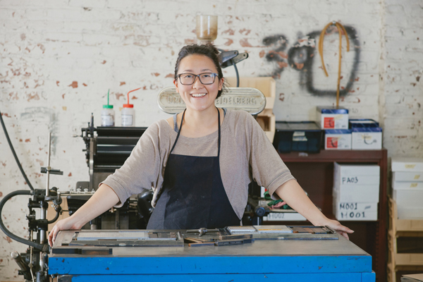
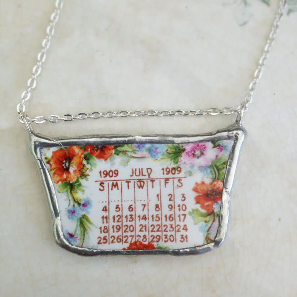
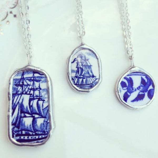
My name is Sherry Insley of Sherry Insley Designs out of Baltimore, MD. I am an artist, metalsmith, teacher, and maker of things and people. I currently work mainly in jewelry, but do also dabble in small sculptural objects, wall pieces, and photography. I come from a background in photography, and while working on my MFA thesis, I taught myself how to weld to make frames for my photography work. My curiosity about metalsmithing was sparked and I dove into metal work.
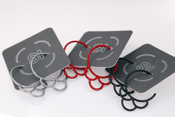
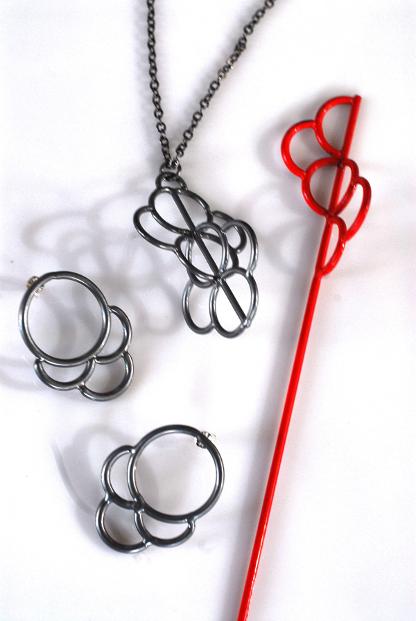
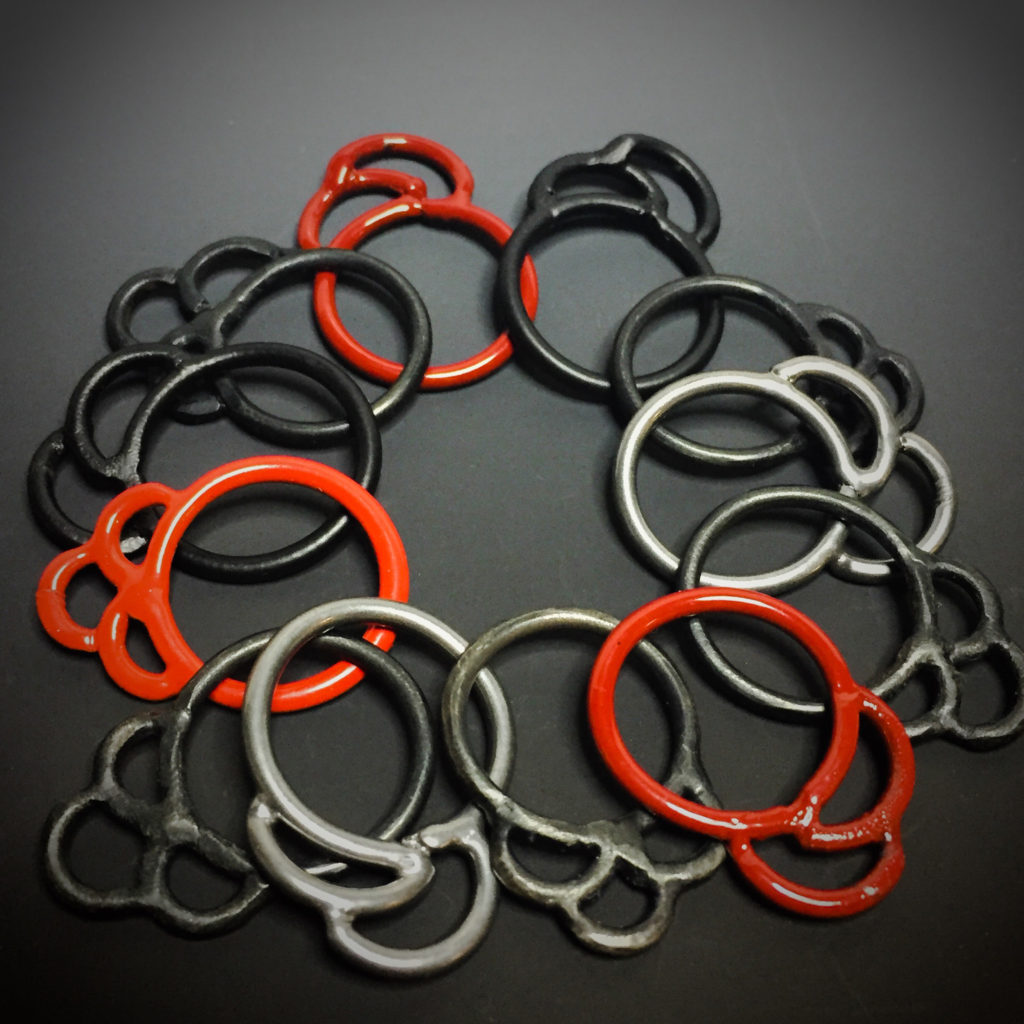
My current work is called the “Crescent Series” and is comprised of welded steel, sterling silver, brass and powder coating. I was influenced by Japanese textile design, the repetitive waves and cloud shapes, and the way positive and negative space is defined. I am also inspired by modern architecture and graphics, as well as more minimalist bold use of line and space. Materially speaking, my interests are in the industrial look and feel of steel, its hardness and durability, vs. the rounded shapes I am forming it into. The steel’s inherent “masculine” qualities contrasting with my design’s softer “feminine” curves. Steel is most commonly associated with building, strengthening, and manufacturing- here through traditionally industrial processes, I am transforming it into objects for adornment.
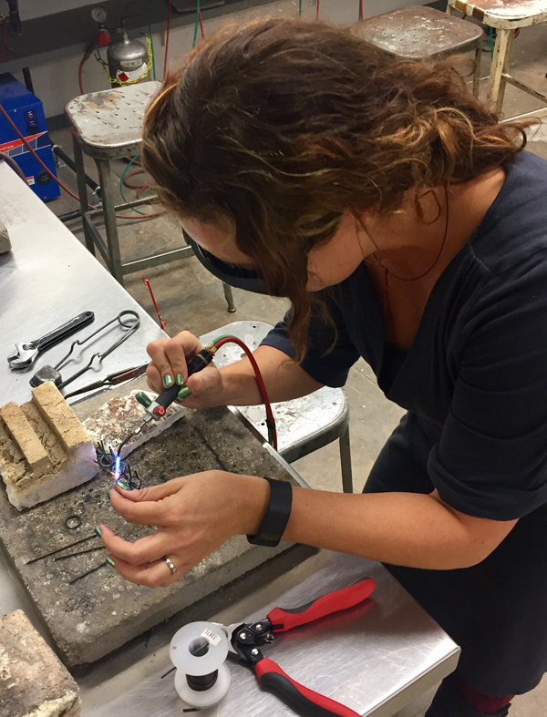
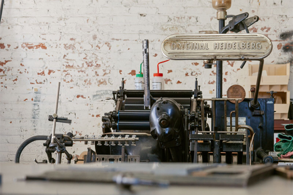
My process begins with mild carbon steel in wire, sheet and rod. I cut it and form with hammers and stakes into the shapes that I want. Then I weld with a very tiny, very hot oxyacetylene torch. I wear the dark glasses because the flame is so bright it can damage your eyes. Next I grind all the welded joins for a smooth appearance. Filing and sanding is next, then it’s off to the powder coating booth! Powder coating is another industrial process I enjoy, it is generally used in the automotive industry. It protects the metal from oxidizing and rust, and the color options are fantastic. How powder coating works is an electrical current is run through the metal to be coated, then you spray the pigment with a powder coating gun. Lastly the piece is cured by heating in an oven at 400 degrees. Powder coating is very durable and provides a lovely smooth finish. My current color pallet, is Ruby Red, Chrome, and Satin Black.
I work mostly out of my home studio in Baltimore, where I live with my very patient husband, super creative 7 year old son, 2 cranky elderly cats, and 1 rescue Boxer in a wheelchair. I do my welding and powder coating at The Baltimore Jewelry Center, where I rent studio time and space, and also take classes. It is a wonderful community of artists and makers, and I wouldn’t be where I am today without it.
I am looking forward to showing at Art Star Craft Bazaar! Please stop by and say hi!
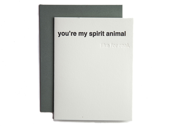
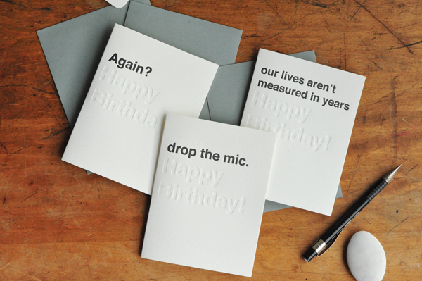
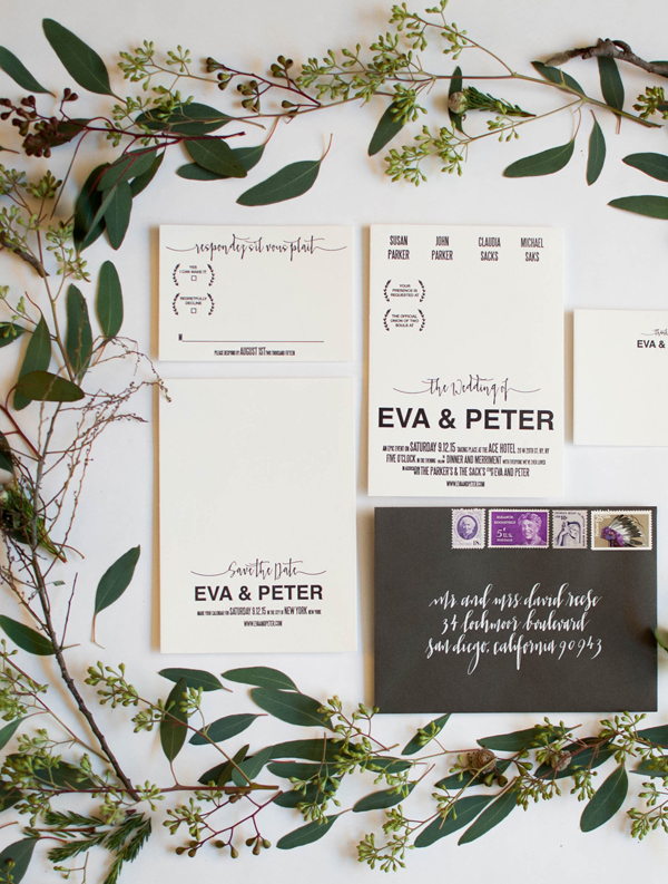
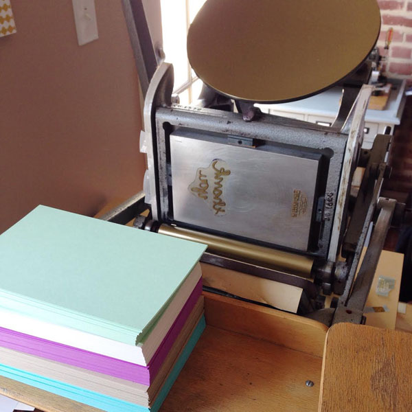
![photo by Rachel Lynn Photography]](https://www.artstarphilly.com/wp-content/uploads/2016/10/miks-letterpress-ink-splatter-wedding-invitation-copy.jpg)
 I’m so looking forward to the
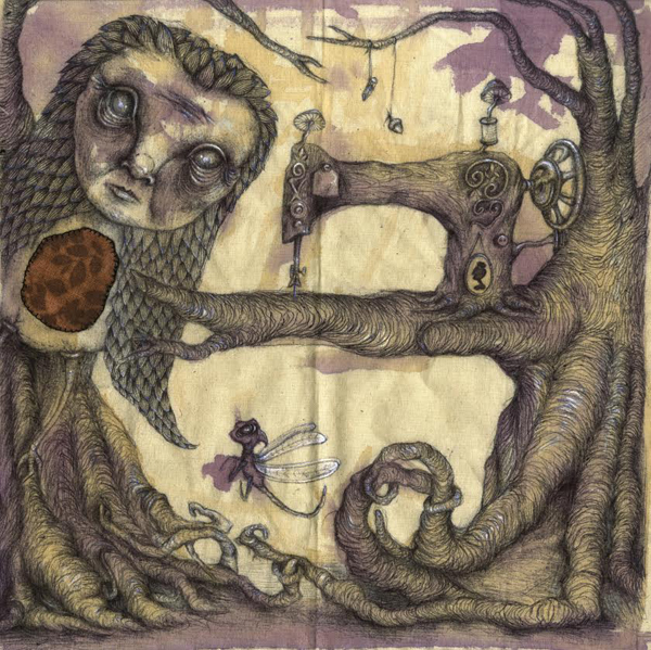
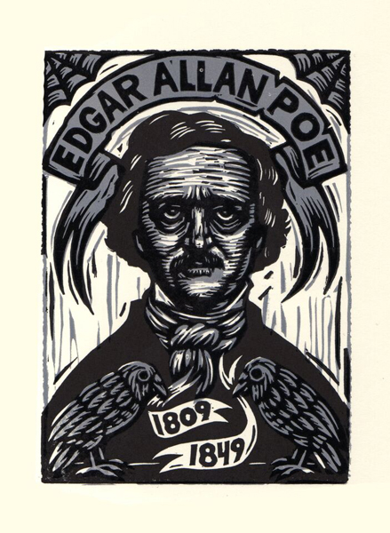
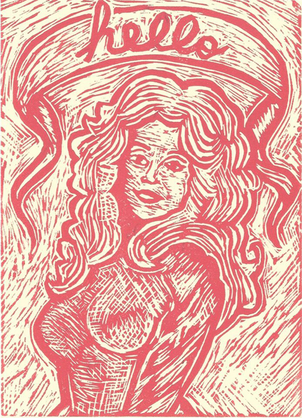
 Hello there! I am an illustrator & soft sculpture maker residing in Baltimore, Maryland. I have a strange fascination with hairless kittens, tea, & otherworldly splendor. I am a collector of old, weathered textiles, driftwood scraps, & anything with a story that’s since been neglected.
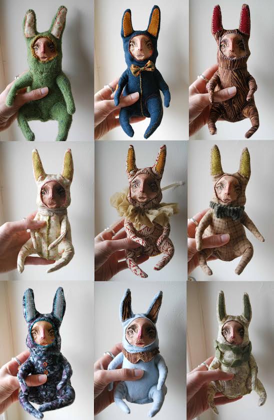
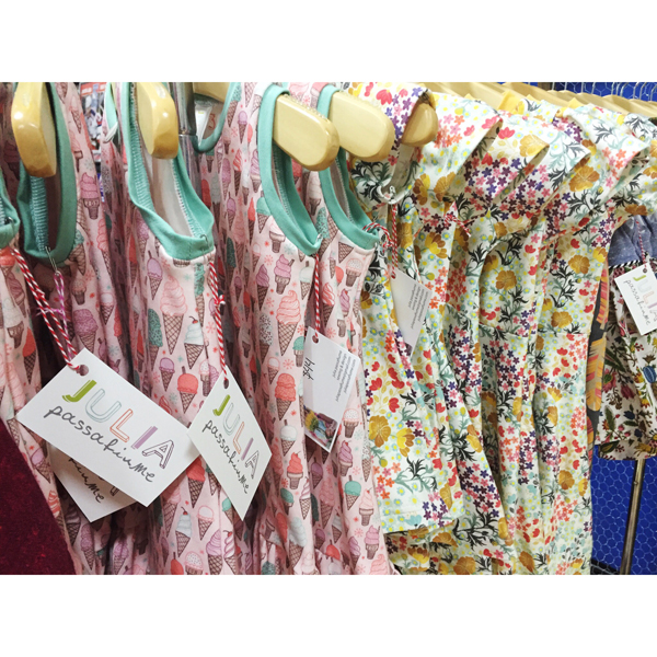
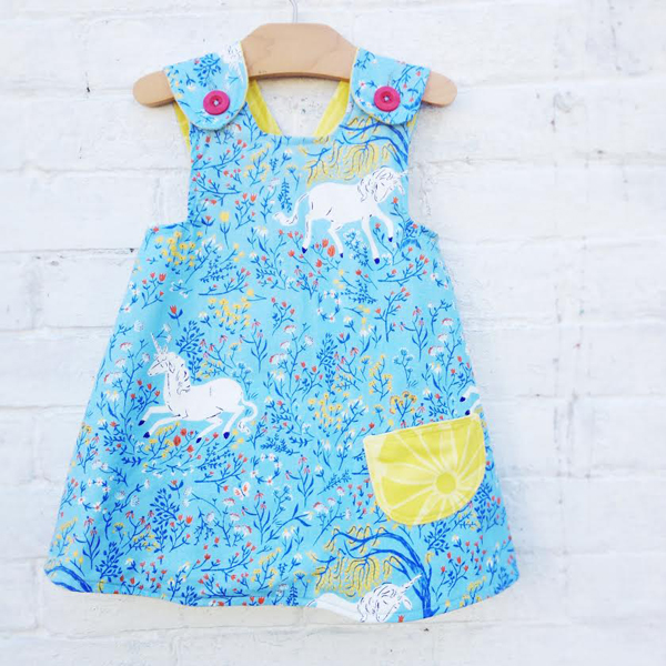
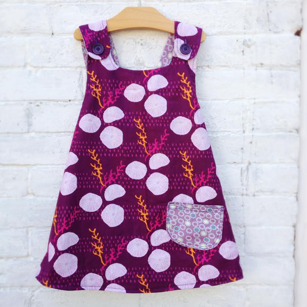
 Wilder always had an eye for color and fabric. She originally started with knitwear but when their daughter came along she wanted to make timeless clothes that weren’t easily found in shops. Believe it or not she’d always been intimidated by sewing, mostly due to the half broken machines that she’d found in thrift stores and been working on. Her friend gave her some expert advice, buy a cheap, new machine with instructions (this is key) and learn the ropes on that. She did and with a few quick lessons from said friend, figured out sewing was not as terrifying as she’d first thought. It, in fact, was fun and liberating!
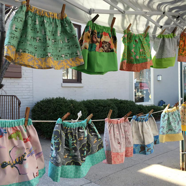
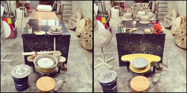
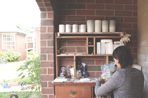
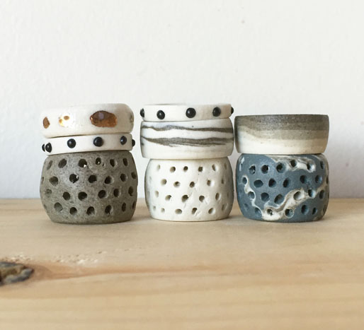
 when i started making pots under Stanley Chester & Albert about two and a half years ago, i had almost 15 years working as a ceramic artist under my belt, including a BFA and an MFA in ceramic sculpture. i started SC&A with a very simple premise: to produce well made vessels that would be accessible to a diverse audience and appeal to a population of people who normally didn’t buy handmade pots. with that in mind, i decided to stick to simple forms like bowls and cups – things that could be used in a variety of ways and be at home in any domestic environment.
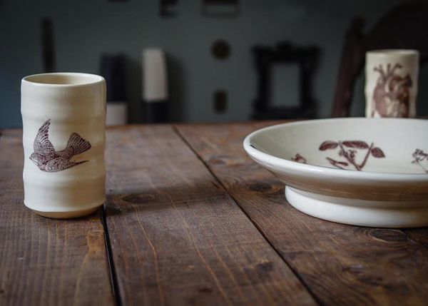 i’ve always been in love with vintage imagery, pop culture and snark, and the unexpected ways they can be combined. as for putting them on pots, it all started about seven years ago when i was still in grad school. i made a vase for a friend’s birthday: on one side was a dead flower, and the other said “BITCH PLS”. no one around me really got why it was funny, but i thought it was hilarious at the time (and still do). ceramics sometimes has a tendency to be overly formal and serious, so i love to disrupt that expectation.
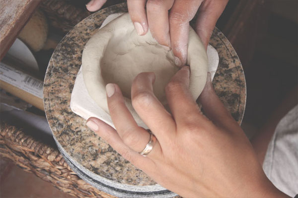
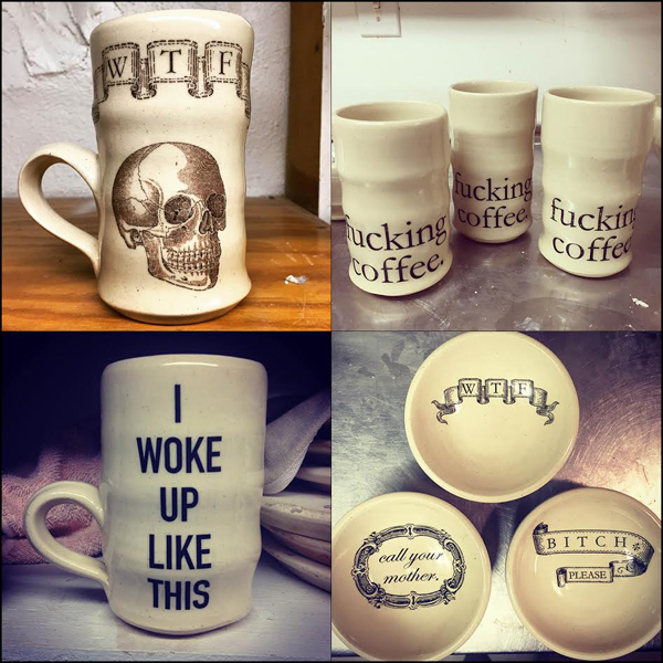 most everything i make starts on the potters’ wheel, thrown by yours truly. i favor simple, elemental forms. everything is thrown generously and has a solid weight and heft to it. i want these pieces to stand up to daily use in your home, not put on a shelf only to be admired.
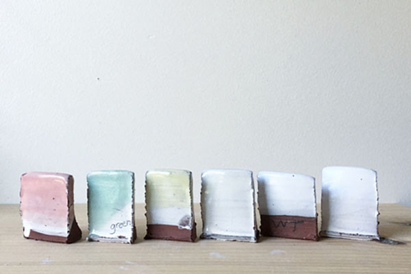
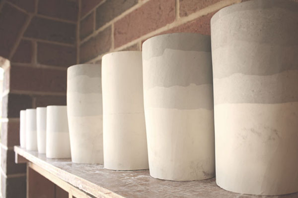
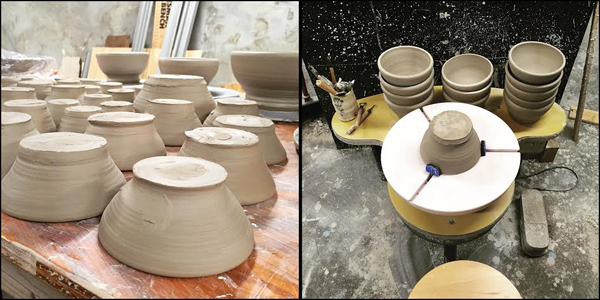
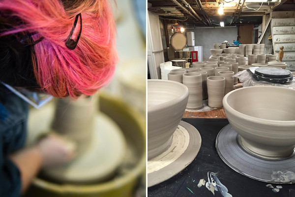 after the pots are trimmed and dried, they are bisque fired to 1860 degrees, and then glazed and fired again to 2232 degrees. almost everything i make is dipped in a clear glaze to allow the clay body (which is a really delicious speckled while stoneware) to shine through. i try to keep glazing very simple, mostly because i really hate glazing, but also because i’m more interested in using the vessel as a blank canvas for the images i apply.
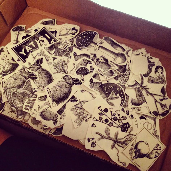
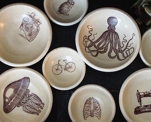
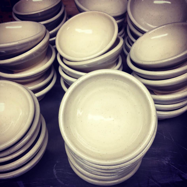 i was introduced to the waterslide decal process by my colleague and friend, Sharon Bartmann. i immediately saw the possibility of decals and ended up running with it like mad. i source my images from copyright free and vintage websites and books, in particular the Dover series of illustration books, which compiles a huge variety of images in one place. after scanning or downloading, i play with the images in Photoshop a bit, adjusting contrast, brightness, proportion and orientation. because of the way the printer works, high contrast images without a lot of shades of gray work best.
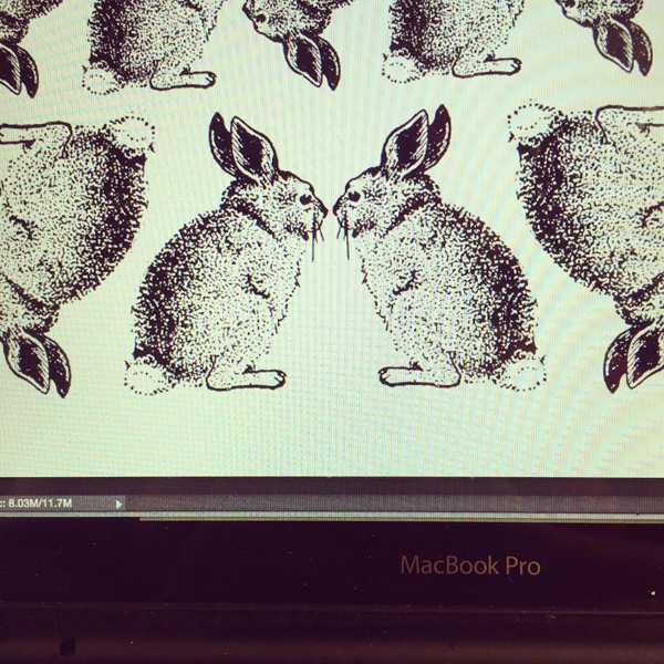
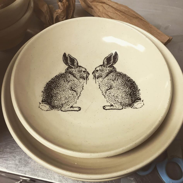
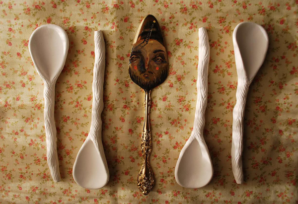
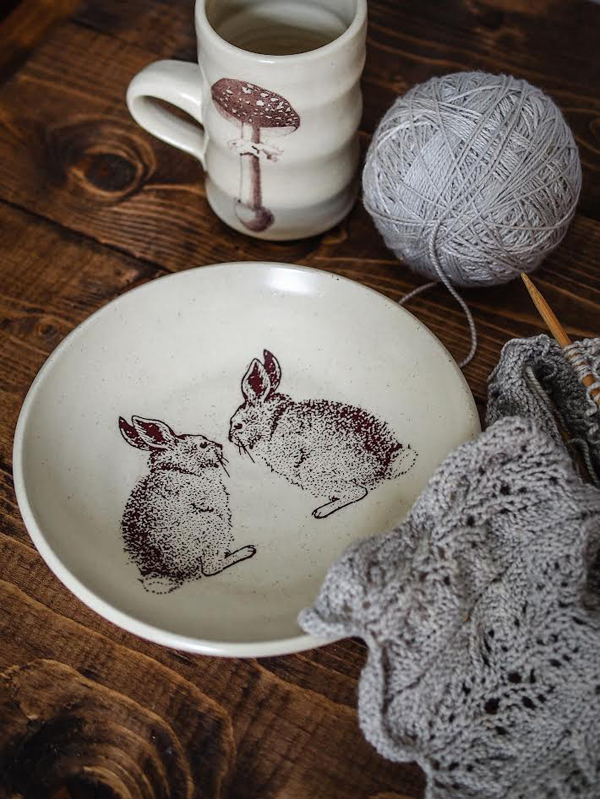 once i have the image the way i want it in Photoshop, i print it out using a special printer and special decal paper. from there, i cut out the image, put it in water, and then affix the cellophane image to the vessel. it’s fired once more to permanently bond the image to the glaze. although the images are printed with black ink, once they are fired they turn a lovely reddish brown sepia color. with that aesthetic in mind, i gravitated toward imagery from the Victorian and Edwardian eras. i love anatomy and so skulls, hearts, bones and brains frequently find their way onto my work.
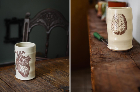
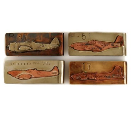
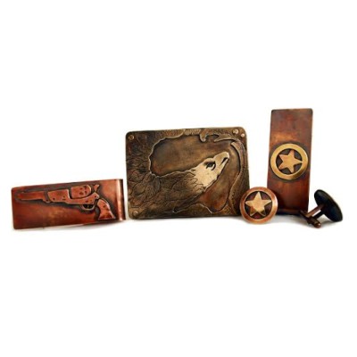 About Dreadnought Workshop: Brett is inspired by the city, American history, and the things he experiences living in an urban setting. Brett’s new line of belt buckles, tie clips, and cufflinks are made using various metal fabricating and casting techniques which he has learned through studio exploration.